Interior Color Palette: How to Choose It Without Mistakes
An interior color palette is rarely chosen systematically — it usually starts with a single picture you liked. Here's how to build a palette from a base color to an accent, and why light matters more than the name on the paint can.
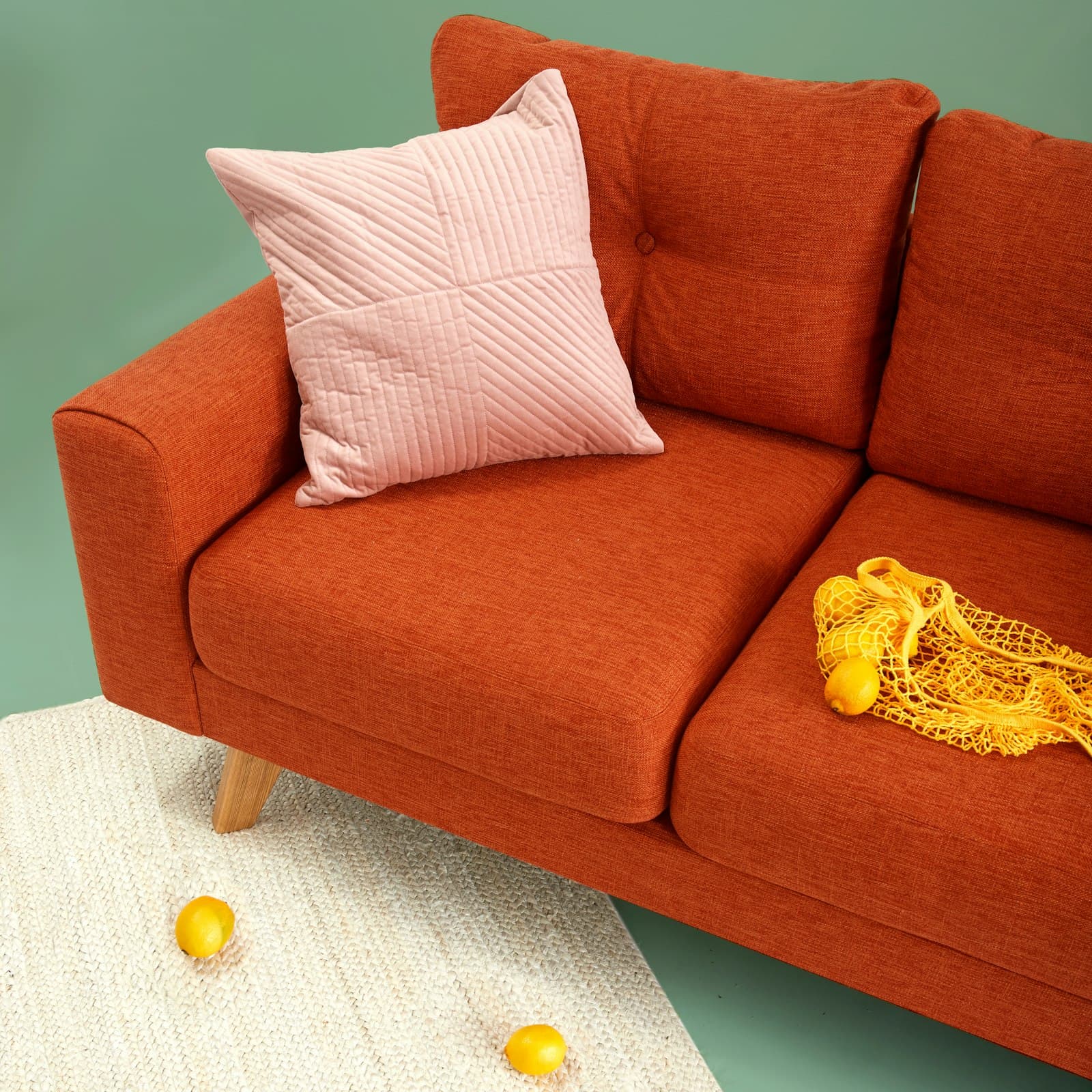
An interior color palette is rarely chosen systematically: it usually starts with a single picture you liked — a sofa in the right shade, a tile in a showroom, or a photo of someone else's living room online — and the rest of the palette gets built by instinct, through trial and near misses. That approach almost always produces a disjointed result: each piece looks fine on its own, but together the room reads as a random set of colors with no internal logic. An interior color palette works as a system, not a collection of lucky finds — every color in it has a role, a share of the total area, and a place where it belongs. Planning that system in advance is far cheaper than repainting walls or replacing textiles after the renovation is done, when the mistake shows up not on a sample but across the real volume of the room.
Interior Color Palette: Where the Choice Actually Begins
The first step isn't wall color — it's the materials and surfaces that can't realistically be repainted overnight: the floor, the countertop, the doors, large furniture. These set the temperature and tone of the future palette, and the walls and textiles adapt to them, not the other way around. If an apartment already has warm parquet and light ceramic tile in the bathroom, a cold grey-blue palette on the walls will clash with those surfaces, even if it looks stylish on its own in a reference photo. The sensible order is to fix the unchangeable materials first, then choose a base wall color to match them, and only at the very end pick the accents — the easiest part to change again in a few years.
The Three Roles Color Plays in an Interior Palette
- Base color — up to 60% of visible surfaces: walls, floor, large furniture. Usually calm and light enough not to tire the eye in everyday use.
- Supporting color — around 30% of the space: curtains, a rug, part of the furniture. It develops the base tone and creates a sense of completeness without competing with it.
- Accent color — no more than 10%: cushions, decor, individual pieces of furniture. It carries the interior's character and is the first thing to change when the room needs refreshing.
- Neutral metal and wood tones — frames, handles, furniture legs. They tie the palette together and aren't usually counted as a separate 'color,' but they shape the overall impression more than people expect.
How Light Changes the Way Color Reads
The same shade of paint looks different on the north and south side of a building, under warm and cold artificial light, in the morning and late in the evening. The most common mistake is choosing a color from a store sample or a photo shot in different lighting, rather than from how it will actually behave in a specific room at different times of day. It's worth planning the palette together with lighting scenarios: warm task light in the evening can pull a cool grey toward a greenish undertone, while daylight from a north-facing window can make even a light beige wall look visually dull. Before the final decision, it makes sense to paint a sample directly on the wall and watch it for at least a day — not choose from a tiny swatch on a phone screen.
Color Room by Room: One Logic, Different Intensity
An interior color palette doesn't have to be identical in every room — what matters is a shared logic that reads clearly as you move from one space to the next. A living room and kitchen, where guests spend more time, usually tolerate bolder accents than a bedroom, where color's job is to help you relax rather than draw attention. A lot of this also comes from the overall style: how a palette is built largely follows from the chosen interior direction — read more about that in our guide on how to choose an interior style. An abrupt shift in palette from room to room with no shared thread — the same neutral floor tone, doors or trim running through them — is usually what makes an apartment feel assembled piece by piece rather than designed as a single space.
Color in an interior shouldn't just 'be liked on its own' — it should work for a specific room, specific light and the specific people who live in it.
Common Mistakes When Choosing a Color Palette
- Picking a color from one small swatch or an online photo — without testing it on the actual wall, in the room's actual lighting.
- Too many equally bold colors at once — with no calm neutral base to let them stand out against.
- Ignoring unchangeable surfaces — the floor, doors, countertops — so the new wall palette ends up clashing with existing materials.
- Avoiding accent color altogether out of fear of getting it wrong — the interior ends up technically safe but faceless.
An interior color palette is the result of a systematic decision, not a series of lucky or unlucky purchases, and it's worth building correctly from the start — alongside the layout and material choices, not as an afterthought. For anyone who wants to understand this logic on their own project, from base color to accents and lighting, the "Home of Your Dreams" course walks through the whole path from idea to realization step by step.